MAAS Site Manager
- Year
- 2023-2024
- Type
- Work Project
TL;DR
Sole designer on MAAS Site Manager, a centralized management interface for multiple MAAS installations, each managing large fleets of bare metal servers. Designed the full MVP including site enrollment, image management, map and table views, and settings. Solved an air-gapped map tile problem by building a proof of concept that reduced tile size from over 100GB to around 100MB. Validated designs through two rounds of user testing with around six sessions each.
MAAS (Metal as a Service) is Canonical’s bare metal management software. It can provision and manage servers even without an operating system installed. The users are deeply technical system administrators who manage large-scale infrastructure deployments across data centers.
I was the sole designer on MAAS Site Manager, working closely with both front-end and back-end engineering. Site Manager was a new companion application designed to address a significant pain point. While performance requirements dictate one MAAS installation per data center, this creates operational challenges: users lack unified oversight of their infrastructure, must replicate configurations and boot images across installations, and frequently struggle to ensure they’re performing actions on the correct MAAS instance. Site Manager was created as the centralized management interface for multiple MAAS installations.
What I designed
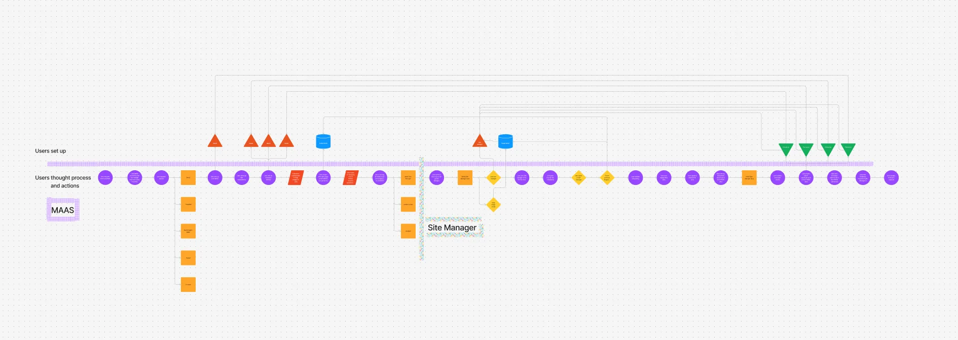
The MVP scope was broad. I designed the enrollment flow, the whole process of creating tokens in Site Manager, using them in MAAS to register a site, and accepting incoming enrollment requests back in Site Manager. It spans two separate applications with different interfaces, so mapping out the full user journey was important.
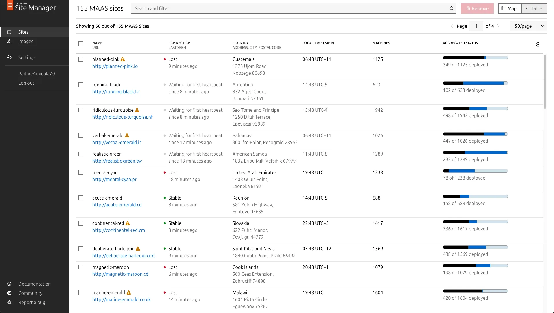
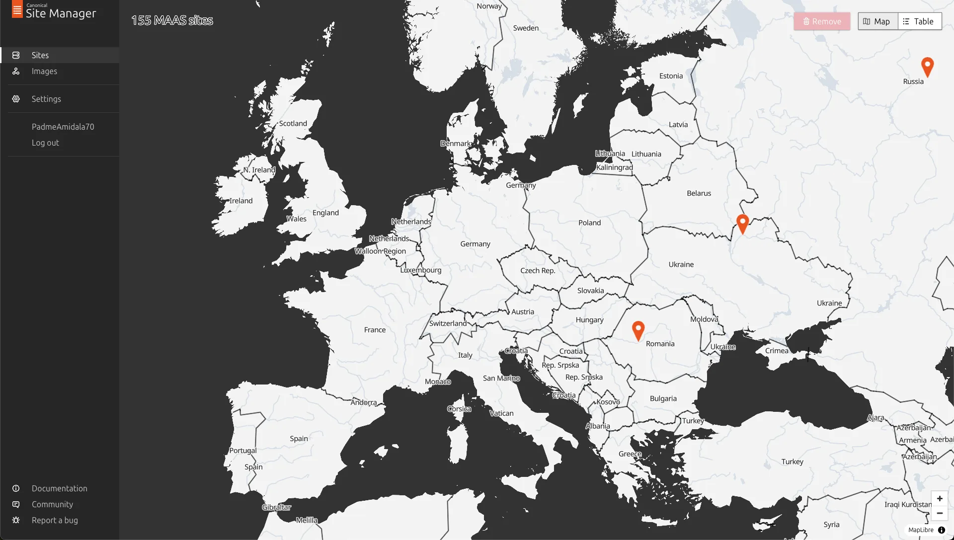
I designed the image management feature, one of the biggest asks from users. When Site Manager is connected to a MAAS site, it acts as its image server, so users can manage OS images for multiple sites at once instead of configuring each one individually. I also designed user profiles, settings, and two complementary ways to view connected sites: a table view for structured browsing and filtering, and a map view for geographic awareness. The map is the focus of this case study.
Designing for sysadmins
The users, system administrators, value efficiency and predictability above almost everything. In interviews they often brought up the concept of “clickops” unprompted, their term for having to repeat the same click patterns in a UI. If something requires repetitive manual interaction, they’d rather have a way to automate or script it. When they do use a UI, they want it to make their work more efficient in as few clicks as possible, or help them make sense of large amounts of data more easily. This shaped every design decision on the project.
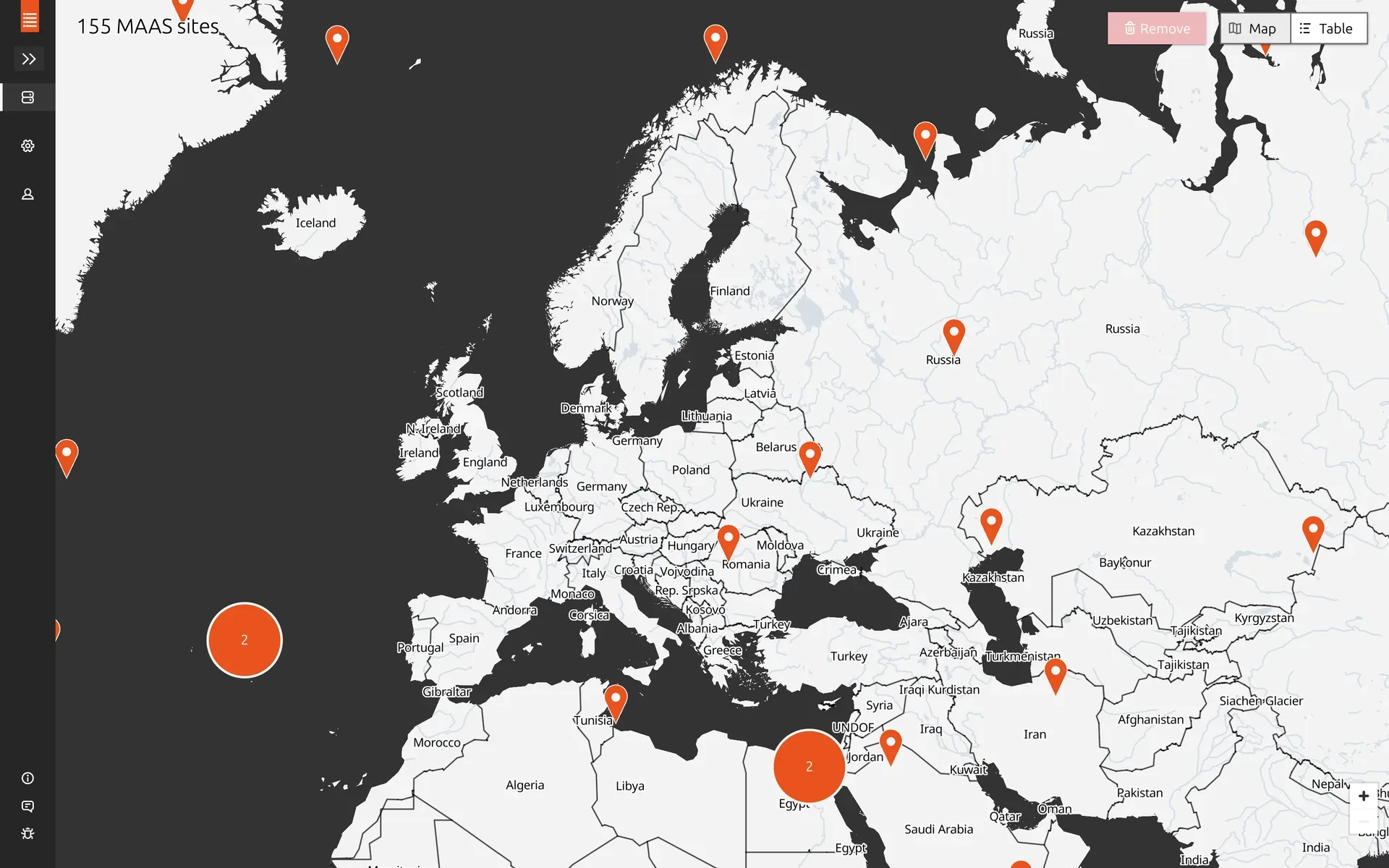
The map
Exploratory user research was done before I joined by my then manager, a designer who also worked on MAAS. She conducted qualitative interviews with MAAS customers who manage multiple sites. A lot of the initial requirements for Site Manager, including the map, came from her research.
The research showed that users needed geographic awareness of their installations. When managing a large fleet of MAAS sites, especially edge nodes deployed for decreased latency, geographic location becomes important. Users need to quickly identify which region is affected when something goes wrong, and they need visibility into data center locations when planning deployments.
A map was the most intuitive way to represent this. But we had a critical constraint from product management: the feature needed to function in air-gapped environments where internet connectivity is restricted or unavailable. Most mapping solutions depend on online services, so this was a significant technical and design challenge from the start.
I started by creating several iterations of wireframes, working through both visual and interaction design challenges.
Scaling to tens of thousands of sites
The design had to accommodate potentially tens of thousands of sites. Displaying 30,000 sites simultaneously would be neither technically performant nor visually useful. Over several iterations, I designed how individual points would merge together into clusters at different zoom levels.
There was a lot of nuance in the details. How does selection work when sites are grouped together? What happens if you previously selected a site and then zoom out so it gets clustered with others? How do you perform actions on a group versus an individual site? These interactions needed careful consideration.
Close collaboration with the developers was important here. The limitations of the map library we were using weren’t always obvious from the design side. We had to stay in close contact about what was feasible in terms of implementation, especially around rendering performance, so I could adjust the designs accordingly.
The map tile problem
During one of these developer feedback sessions, we identified a significant technical challenge. Off-the-shelf open source map tiles require over 100GB of storage. Shipping that with Site Manager would be completely impractical, particularly since most users self-host the application.
One option was using an online map service like OpenStreetMap, but that would violate the air-gapped requirement. Beyond the technical constraint, I had concerns with this approach anyway: limited control over visual appearance, excessive detail that would distract users from their primary tasks, and visual inconsistency with our brand. Standard map tiles at street level are packed with information, points of interest, individual streets, landmarks, that is completely irrelevant for a server management use case.
After realizing the size problem, the developers didn’t explore alternative approaches much further. But I had recently worked with GIS data and map tiles on a personal project (detecting potential new rock climbing areas using machine learning on satellite images), so I had some idea of how map tiles are built, what data sources exist, and what tooling is available. I gave it a try and built a proof of concept demonstrating that it was possible to create map tiles with sufficient detail for our use case, custom styling that matched our brand, and a dramatically reduced file size, around 100MB instead of over 100GB.
I achieved this by customizing the tile building process with tippecanoe, selecting only the map features necessary for a bare metal server management use case. Country borders, major cities, basic geography. Everything else, the street-level detail, points of interest, terrain shading, was stripped out. I shared the proof of concept with the engineering team as a GitHub repository, and they used it as a reference to implement a proper system for generating optimized maps for the application.
Testing with users
I conducted user testing in two rounds, each with around six sessions. The first round used initial draft designs to validate the overall direction. The second round tested more polished designs before implementation to catch issues early. Participants were internal proxy users, field engineers who would both use the tool themselves and interact frequently with customers who would be users too.
The testing didn’t surface major usability issues with the core flows. The main findings were smaller papercut issues, things to clean up visually, UX copy to tighten, minor interaction details to smooth out. The map approach, the simplified tiles, the clustering, the interaction model, all held up well in testing.