Canonical Design tokens
- Year
- 2024-2026
- Type
- Work Project
TL;DR
Initiated and led the design token effort at Canonical. Audited hundreds of existing variables, wrote the specification through collaborative sessions, authored token sets across dimensions, typography, and color, and helped build the tooling to transform and distribute them. Contributed the official JSON schema to the W3C Design Tokens Community Group. Engineering implemented the tokens from my handover, and they're now integrated into Figma.
A couple of years ago, Canonical changed its own logo and Ubuntu’s logo. You can still find the old logo in various places across Canonical’s internal and external interfaces. That alone tells you something about the state of the infrastructure. The old logo was hard-coded everywhere, and we still haven’t found all the places it lives. If we had referenced one central place for logos, updating it once would have scaled everywhere.
But this wasn’t just a logo problem. When I joined Vanilla, Canonical’s design system, it could probably be described more as a CSS library. Visual foundations existed mostly as SCSS variables, sometimes hard-coded directly into components. Meanwhile, other teams had started implementing their own interpretations of Vanilla in Flutter, and there was a Figma library that was supposed to mirror the CSS components. Keeping colors, typography, spacing, and other visual foundations in sync between Figma, CSS, and Flutter was entirely manual. And manual means mistakes. Things were inconsistent.
Modernizing the design system
It was clear we needed a centralized, systematic approach to visual foundations. In other words, design tokens. I pushed for and led this effort.
The trigger for me was personal. I’m in charge of Canonical’s Figma libraries, and when I rebuilt them from scratch, I had to manually inspect the CSS source code to figure out the actual values and transfer them to Figma by hand. That process made it obvious: this doesn’t scale. If we wanted a design system that could actually keep multiple platforms in sync, we needed tokens as the foundation.
There wasn’t really resistance to the concept of design tokens itself. But there were lengthy discussions about naming, values, and implementation. The biggest debate was whether we should follow the W3C Design Tokens Community Group specification. I advocated strongly for it. Even though the spec wasn’t fully mature yet, it was clearly where the industry and its tooling were heading. Some team members weren’t fully convinced because the spec has its restrictions and is opinionated about how certain things should be done. But with strong industry signals, a first stable version released, Figma and Penpot officially adopting it, we ended up committing to compliance with the W3C spec.
Auditing what exists
I started by creating an inventory of existing variables and their flows from variables to actual usage in components. This approach, suggested by Nathan Curtis in his writing on the topic, made sense for understanding the current needs of our design system and its users. I had a head start since building the Figma libraries had already required me to extract all visual information from the source code.
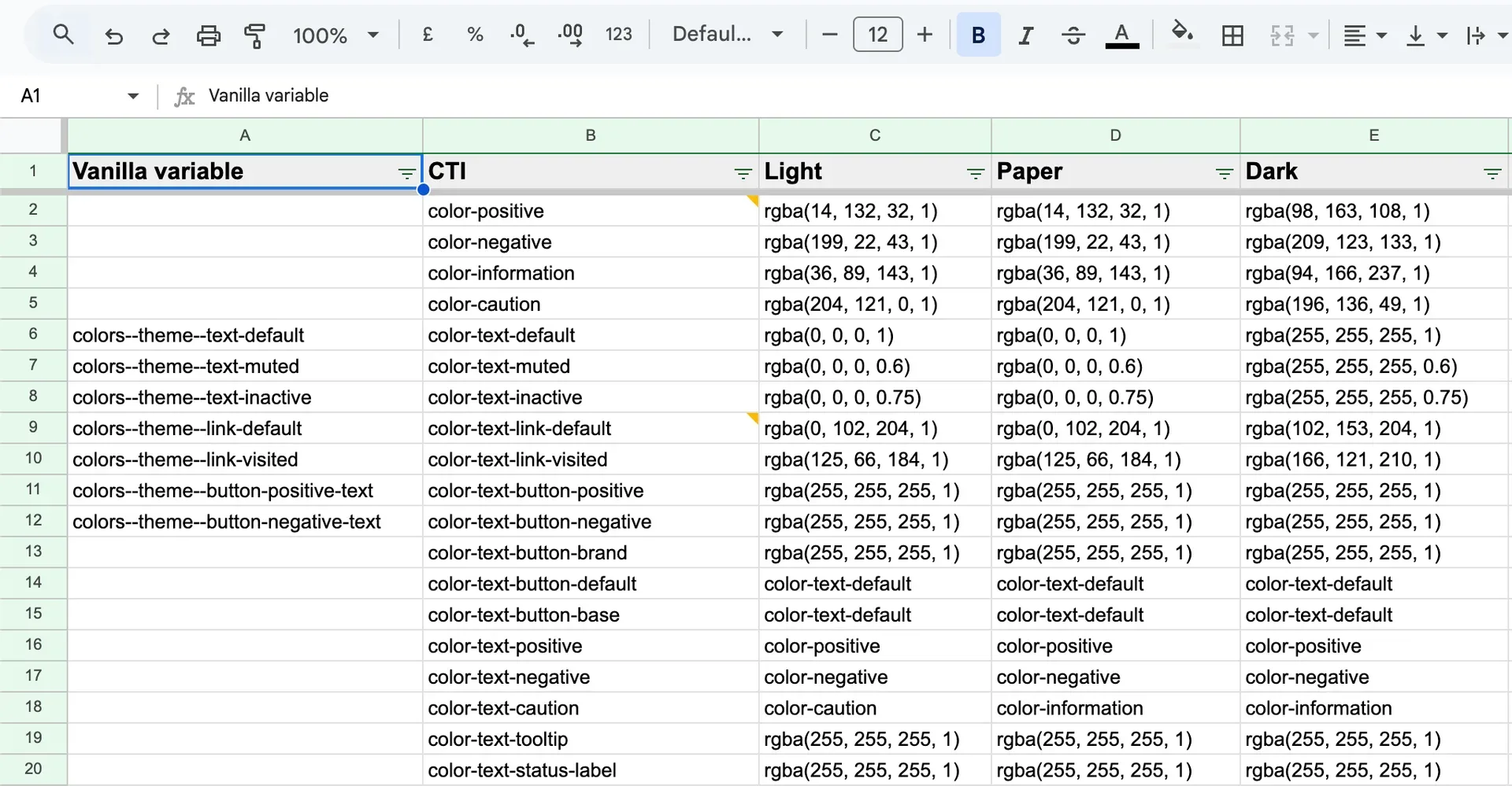
The audit revealed hundreds of variables. Colors were especially messy. We had around 60 shades of grey alone, all added ad-hoc over the years with no system behind them. Near-duplicates were everywhere, colors differing by one or two values that clearly should have been the same token. It was obvious that one of the bigger things we needed wasn’t just tokenizing existing values but a complete overhaul of our color system. I ended up leading that as well.
Research and specification
While conducting the inventory, I performed extensive research on design tokens. Despite their seemingly straightforward nature, implementing them properly is surprisingly complex. A significant portion of the challenge lies in establishing naming conventions, structure, and processes that work across an organization.
Design tokens specification
Working with another designer, I drafted an initial specification for how to structure and name design tokens at Canonical. Then, following the same collaborative format that had worked well for the Figma libraries, I organized several discussion sessions where the wider team and stakeholders went through every section of the spec until we had something everyone agreed on.
We discussed naming extensively, but honestly that wasn’t the most contentious part. The hardest discussions were around how to structure color themes, light and dark mode specifically. This was also where the W3C compliance debate resurfaced most strongly. The spec is opinionated about how theming should work, and not everyone was immediately comfortable with those constraints. But after working through the implications together, we reached agreement.
Through this process, we landed on the taxonomy for design tokens at Canonical: naming conventions, token organization, tier structure, and processes for storing and updating them.
Creating the tokens
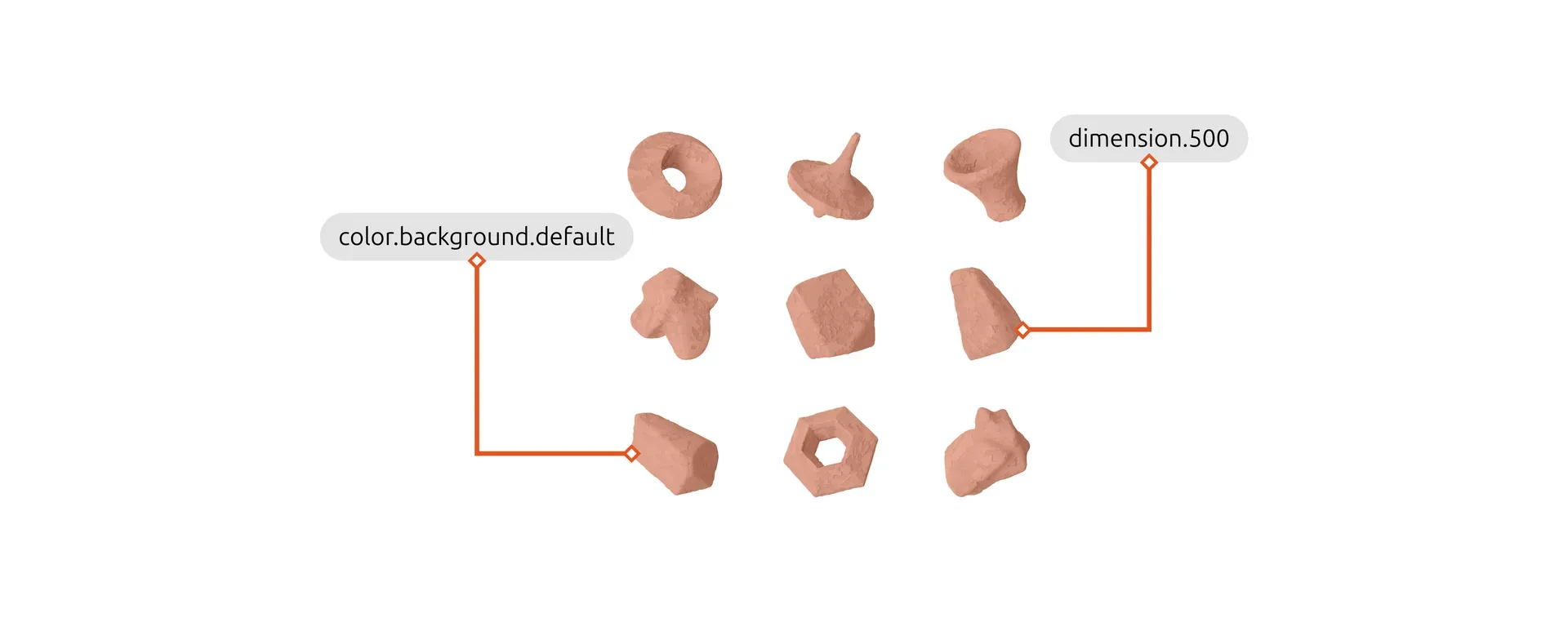
With the inventory, research, and taxonomy complete, it was time to actually create the tokens. I tackled them in order of complexity: dimensions first, then typography, then color. Dimensions were relatively straightforward. Typography was harder. And color, as the audit had already made clear, was a much bigger undertaking.
This wasn’t just about translating existing values into a token framework. We were modernizing the design system, so I used this as an opportunity to adopt a more systematic approach to the visual foundations themselves.
Color was the clearest example of this. We previously didn’t have a proper UI palette. Colors had been added on an as-needed basis for years, and the audit had surfaced hundreds of them. I created a new palette based on Matthew Ström’s article about generating color palettes for design systems, where he describes an approach based on contrast between shades rather than lightness. This makes creating accessible color combinations much easier. I wrote about part of this exploration in a blog post about generating accessible color palettes inspired by APCA, though the final palette we landed on evolved further from there.
In total, I authored token sets across primitive dimensions, primitive and semantic typography, and color.
Building the tooling
Design tokens need a build system to transform the authored token files into platform-specific outputs, CSS custom properties, Flutter constants, Figma variables. I helped build parts of this tooling, while engineering handled most of the infrastructure and the platform-specific plugins like the CSS output.
We chose Terrazzo as our token transformer over the more commonly used Style Dictionary. The reason was straightforward: after committing to the W3C spec, we wanted tooling that was equally committed. Terrazzo was more aligned with the stable version of the spec and its direction.
While working on this project, I became a member of the W3C Design Tokens Community Group. I noticed that the spec didn’t have an official JSON schema yet, so I started building one. When the opportunity came to contribute it, I did, and it became the official Design Tokens JSON schema.
Based on that schema, I also built an agent skill that gives AI coding agents full awareness of the specification and schema. It lets an agent write valid design token JSON and verify it against the schema using an AJV validation script. This came out of a practical need: I wanted to be able to use AI tools effectively in the token authoring workflow, and for that they needed to actually understand the format.
I also built a Terrazzo plugin for Figma that transforms tokens into a format compatible with Figma’s native design token import feature. This is what we used to bring the tokens into our Figma libraries.
Handover and adoption
I created an official handover repository containing all the token files I had authored, structured and ready for engineering to consume.
Engineering has since implemented the tokens, and we are now integrating them into our Figma libraries and the new design system. The spec was delivered and approved, the color palette replaced hundreds of ad-hoc values with a systematic foundation, and the tooling, from the Terrazzo build system to the Figma plugin to the agent skill, is in active use.